Introduction
Your resume may contain excellent experience, relevant skills, impressive projects, and the right qualifications, but none of that helps much if the document is difficult to read.
One of the simplest ways to improve resume readability is choosing an appropriate font. The font you use affects how comfortably someone can read your resume, how much information fits on the page, how professional the document feels, and how consistently it appears across different devices and PDF viewers.
But choosing a resume font isn't about finding one magical typeface that guarantees an interview or automatically gives you a higher ATS score. There isn't a universal "best ATS font" that makes a resume successful.
Instead, the goal is to choose a font that is clear, professional, readable, and appropriate for the role , while keeping the overall resume structure simple.
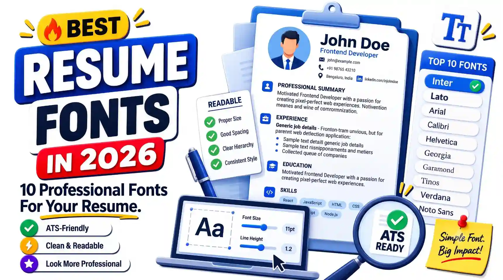
In this guide, we'll look at 10 professional fonts worth considering for resumes in 2026. We'll also cover recommended font sizes, serif versus sans-serif fonts, ATS considerations, fonts to avoid, how many fonts you actually need, spacing and hierarchy, and how to choose the right option for your particular resume.
Why Does Your Resume Font Matter?
A resume font isn't going to turn a weak application into a strong one. However, the wrong font can make a strong resume harder to read.
Think about what happens when a recruiter opens your resume. They aren't usually reading every sentence from beginning to end on their first pass. They're looking for useful information such as your current or target role, experience, skills, education, achievements, and other qualifications relevant to the position.
A readable font supports that process by creating a clear visual hierarchy.
Compare two resumes containing exactly the same information. One uses a clean font with comfortable spacing and clearly differentiated headings. The other uses a decorative typeface, extremely small text, and inconsistent formatting.
The content hasn't changed, but the experience of reading it has.
A good resume font can help with:
- Making your resume easier to scan.
- Keeping body text comfortable to read.
- Creating a clear distinction between headings and regular content.
- Maintaining a professional appearance.
- Using page space efficiently without making text unnecessarily small.
- Keeping your resume visually consistent across sections.
Font choice is therefore one part of a much bigger picture. Your resume still needs strong content, relevant terminology, sensible formatting, and clear evidence of your skills.
If you're specifically interested in how Applicant Tracking Systems, resume parsing, and ATS scanners work, our guide to ATS scanners and resume parsing explains that process in more detail.
What Makes a Good Resume Font?
Before choosing a font from a list, it's useful to understand what makes a typeface suitable for a resume in the first place.
1. It Should Be Easy to Read
Readability should be your first priority. Your recruiter shouldn't have to concentrate to distinguish individual letters or words.
A font that looks interesting in a design preview may become tiring when used across several hundred words of resume content.
2. It Should Look Professional
Your resume is a professional document. That doesn't mean it has to look boring, but the typography should support your content rather than compete with it.
A clean font allows the recruiter's attention to remain on your qualifications.
3. It Should Work Well at Smaller Sizes
Resume body text is usually smaller than the text you would use in a presentation or poster. A good resume font should remain comfortable to read at a relatively compact size.
This becomes especially important when you're trying to keep a fresher resume concise without sacrificing readability.
4. It Should Have Clear Character Shapes
Some fonts make characters look unusually similar. This can become noticeable with letters and numbers that are easy to confuse.
Clear character shapes are useful for information such as dates, phone numbers, email addresses, URLs, technical skills, and job titles.
5. It Should Support a Clear Hierarchy
A resume doesn't need multiple fonts to create hierarchy. A good typeface can usually work across your entire document by changing size, weight, capitalization, and spacing.
For example:
- Name: larger and more prominent.
- Section headings: slightly larger or bold.
- Job titles: bold or semibold.
- Body text: regular weight.
- Dates and secondary details: slightly less prominent while remaining readable.
6. It Should Work in Your Final File Format
A font can look perfect while you're editing your resume but behave differently after export. That's why you should always inspect the final PDF before submitting it.
Check that the text remains selectable, characters haven't changed unexpectedly, spacing looks correct, and the document still looks professional when opened on another device.
What Font Is Best for an ATS-Friendly Resume?
If you're searching for the "best ATS font," you will probably find lists claiming that certain fonts are guaranteed to work better with Applicant Tracking Systems. The reality is more practical: there is no single font that guarantees a higher ATS score.
Applicant Tracking Systems can differ in how they process and organize resume information. An employer may also configure its recruitment workflow differently from another employer.
What matters more is whether your document contains readable text and a logical structure.
A sensible ATS-friendly approach is to choose a font that:
- Is easy to read at normal resume sizes.
- Uses clear and distinguishable characters.
- Doesn't rely on decorative symbols to communicate information.
- Remains consistent throughout the document.
- Exports correctly into your final PDF or document format.
Fonts such as Inter, Lato, Arial, Calibri, Helvetica, Georgia, and other conventional professional typefaces can all be reasonable choices when the rest of the resume is properly structured.
Formatting problems such as complicated tables, excessive graphics, image-based text, unclear section headings, or unusual reading orders can matter more than whether you selected Arial instead of Inter.
For a broader look at formatting and content problems that can weaken a resume, see our guide to the 50 most common resume mistakes .
ResumeInator Tip: Choose a font because it is readable and professional first. ATS compatibility is a document-structure concern, not a hunt for one magic typeface.
10 Professional Resume Fonts to Consider in 2026
There isn't one font that is perfect for every candidate or industry. The options below are professional typefaces worth considering based on readability, visual style, and the type of resume you're creating.
The numbering below is for navigation, not a universal ranking. A font appearing first doesn't mean it is objectively better than the one listed next.
- Inter
- Lato
- Arial
- Calibri
- Helvetica
- Georgia
- Garamond
- Tinos
- Verdana
- Noto Sans
1. Inter
Inter is a modern sans-serif typeface designed with screen readability in mind. Its clean shapes make it comfortable to read across headings, bullet points, and longer sections of resume content.
It works particularly well when you want your resume to have a modern technology or startup-oriented appearance without becoming overly decorative.
Good fit for: Software development, engineering, product roles, digital marketing, design, and other modern professional environments.
Consideration: Its contemporary appearance may feel less traditional if you're aiming for a deliberately classic resume style.
2. Lato
Lato is a sans-serif typeface with a professional appearance that remains approachable and readable. Its proportions work well for resumes because it can create a clear hierarchy without making the document feel heavy.
It is flexible enough for technical, business, administrative, and creative applications.
Good fit for: Business professionals, developers, marketers, project managers, students, and general-purpose resumes.
Consideration: Its personality is subtle, so it may feel less distinctive than some more stylized choices.
3. Arial
Arial is a straightforward and familiar sans-serif font. Because it has been widely used in professional documents for years, recruiters generally don't need to adjust to an unusual typeface.
Good fit for: Almost any industry, including business, finance, administration, technology, education, healthcare, and entry-level applications.
Consideration: Arial is dependable but relatively generic, so candidates wanting a more contemporary visual identity may prefer Inter or Lato.
4. Calibri
Calibri is a familiar modern sans-serif font widely associated with professional office documents. Its rounded appearance can create a clean and approachable resume style.
Good fit for: Business, administration, finance, education, consulting, and general professional resumes.
Consideration: Because it is so familiar, it may not give your resume a particularly distinctive visual identity.
5. Helvetica
Helvetica is a classic sans-serif typeface known for a clean and restrained appearance. It can create a polished minimalist resume when paired with sensible spacing and hierarchy.
Good fit for: Design, marketing, architecture, business, technology, and roles where clean visual presentation is useful.
Consideration: Availability can vary depending on the operating system and software, so always inspect the final exported file.
6. Georgia
Georgia is a serif typeface with a traditional and formal appearance while remaining readable on screens.
Good fit for: Finance, law, education, publishing, communications, consulting, and traditional professional environments.
Consideration: Its classic style may feel less contemporary for heavily technology-focused or highly minimalist resumes.
7. Garamond
Garamond refers to a family of classic serif typefaces with a long history in book and editorial typography. It can give a resume an elegant, traditional appearance and can work well for text-heavy documents.
Good fit for: Academic applications, publishing, writing, humanities, education, and traditional professional resumes.
Consideration: Different Garamond variants can look noticeably different, so check the exact version you're using and inspect the final PDF.
8. Tinos
Tinos is a serif typeface designed as a metrically compatible alternative to commonly used Times-style fonts. Its familiar proportions make it suitable for professional documents where readability and a traditional appearance are important.
Good fit for: Traditional resumes, academic applications, business roles, and candidates who prefer serif typography.
Consideration: Its traditional style may not fit every modern visual resume design.
9. Verdana
Verdana was designed with screen readability in mind, using relatively generous spacing and clear character shapes. This makes it easy to distinguish individual letters even at compact sizes.
Good fit for: General professional resumes, administration, education, customer service, and readability-focused documents.
Consideration: Its relatively wide appearance can use more horizontal space than some other fonts.
10. Noto Sans
Noto Sans is part of Google's Noto family, which was created with broad language and script coverage in mind. It provides a clean sans-serif appearance and can be particularly useful for multilingual documents.
Good fit for: International applications, multilingual resumes, technology, business, education, and general professional use.
Consideration: The Noto family contains many related fonts, so choose the specific variant you need and verify that it is preserved correctly in the final document.
Quick Comparison of the 10 Fonts
If you're still unsure which font to use, this comparison can help you narrow down the choices. Remember that the purpose of the table is to compare characteristics, not to establish a universal ranking.
| Font | Style | Good Fit For |
|---|---|---|
| Inter | Modern sans-serif | Technology, startups, modern professional resumes |
| Lato | Modern sans-serif | Business, technology, marketing, general use |
| Arial | Classic sans-serif | Almost any industry |
| Calibri | Modern sans-serif | Business and general professional roles |
| Helvetica | Minimalist sans-serif | Design, marketing, business, technology |
| Georgia | Classic serif | Finance, education, law, communications |
| Garamond | Traditional serif | Academic, publishing, humanities |
| Tinos | Traditional serif | Business, academic, traditional resumes |
| Verdana | Readable sans-serif | General professional use and readability-focused resumes |
| Noto Sans | Modern sans-serif | International and multilingual resumes |
For example, a software developer might naturally prefer Inter or Lato, while someone applying for an academic or publishing position might prefer Georgia or Garamond. A general business resume could work equally well with Arial, Calibri, or Lato.
The right choice ultimately depends on readability, the role you're targeting, the amount of content you need to present, and the visual style you want your resume to communicate.
How Many Fonts Should You Use on a Resume?
You usually don't need more than one font on a resume. A single well-chosen typeface can create a strong visual hierarchy through changes in size, weight, capitalization, and spacing.
Many resumes become unnecessarily complicated because candidates use one font for their name, another for headings, another for body text, and sometimes another for dates or contact information.
Instead, start with one readable font and use different weights and sizes to create structure.
For example:
- Your name: approximately 20-28 pt, bold.
- Section headings: approximately 12-15 pt, bold.
- Job titles: approximately 11-13 pt, semibold or bold.
- Body text: approximately 10-12 pt, regular.
- Dates and secondary details: slightly less prominent while remaining comfortably readable.
These are starting points rather than strict rules. The visual size of text varies between typefaces, so always judge the actual result on the page.
If you do decide to combine fonts, use restraint. A serif heading with a sans-serif body font can work, for example, but the two typefaces should complement each other rather than compete for attention.
ResumeInator Tip: One good font with strong hierarchy is usually better than several fonts fighting for attention.
What Font Size Should You Use on a Resume?
Font size matters almost as much as font choice. A beautiful typeface becomes less useful if the text is so small that someone has to strain to read it.
For many resumes, a body font size somewhere around 10 to 12 points is a practical starting range. The ideal size depends on the specific font, the amount of content, and the overall design.
Recommended Resume Font Sizes
- Body text: approximately 10-12 pt.
- Job titles: approximately 11-13 pt.
- Section headings: approximately 12-15 pt.
- Your name: approximately 20-28 pt.
These are guidelines rather than universal standards. Different fonts have different visual proportions even when they use the same numerical point size.
For example, 11 pt in one typeface may look noticeably larger or smaller than 11 pt in another. That's why you should judge the actual appearance of the document rather than following a number blindly.
Content First, Spacing Second, Font Size Last
One of the most useful rules when formatting a resume is:
Content first → spacing second → font size last.
If your resume doesn't fit comfortably on one page, first remove unnecessary content, repeated information, generic statements, and excessive spacing. Only then consider making small typography adjustments.
Don't Shrink Your Font Just to Fit One Page
One of the most common resume formatting mistakes is reducing the font size dramatically because the resume is slightly too long.
If your resume doesn't fit comfortably on one page, look for unnecessary content first. Remove repeated information, shorten overly long bullets, eliminate irrelevant details, and tighten excessive spacing.
A concise resume with comfortable typography is usually better than a crowded page filled with tiny text.
ResumeInator Tip: If reducing your font size is the only way to make your resume fit, your first problem may be the amount of content rather than the font.
Serif vs Sans-Serif Fonts: Which Is Better for a Resume?
The difference between serif and sans-serif fonts is primarily the presence or absence of small finishing strokes on characters.
Serif fonts include examples such as Georgia, Garamond, and Tinos. They often create a more traditional or formal appearance.
Sans-serif fonts include examples such as Inter, Lato, Arial, Helvetica, and Noto Sans. They generally have a cleaner and more contemporary appearance.
When Should You Choose a Sans-Serif Font?
A sans-serif font can be a natural choice if you want your resume to feel modern, minimal, or technology-oriented.
They can work particularly well for:
- Software development
- Engineering
- Technology
- Digital marketing
- Product management
- Startups
- Modern business roles
When Should You Choose a Serif Font?
Serif fonts can work well when you want a more traditional, established, or editorial appearance.
They can be a good fit for:
- Law
- Finance
- Education
- Academia
- Publishing
- Writing
- Traditional professional environments
However, there is no rule saying a developer must use a sans-serif font or a lawyer must use a serif font. Your content, readability, and overall presentation matter more than following a rigid industry stereotype.
If you're choosing between two equally readable fonts, let the visual character of the typeface support the tone you want your resume to have.
Resume Font Spacing and Line Height
Choosing the right font is only half of the typography equation. Spacing determines how comfortable the resume is to scan.
If lines are packed too closely together, large sections of text can become difficult to follow. If the spacing is excessive, your resume may become unnecessarily long.
Keep Body Text Comfortable
Your body text should have enough vertical space for the reader to distinguish one line from another. The exact line-height setting depends on the font and size, so there isn't one number that works perfectly for every resume.
As a starting point, body text often looks comfortable with line spacing around 1.1 to 1.3 times the font size. Adjust it visually after exporting the document.
Use Space Between Sections
Section spacing helps the reader understand where one part of the resume ends and another begins.
PROFESSIONAL EXPERIENCE
Frontend Developer
ABC Technologies | 2024-2026

• Developed reusable React components for customer-facing applications.
• Improved page performance and reduced unnecessary rendering.
• Collaborated with backend developers to integrate REST APIs.

EDUCATION
Bachelor of Technology in Computer Science
ABC University | 2020-2024
Notice that the spacing creates separation without requiring decorative lines, boxes, or large graphic elements.
Don't Use Spacing as a Substitute for Editing
Increasing spacing can make a resume look more comfortable, but it shouldn't be used to artificially stretch a short resume or compensate for weak content.
The best resumes generally have a natural rhythm: enough space to separate ideas while keeping related information visually connected.
Common Resume Font Mistakes and Fonts to Avoid
There isn't a universal blacklist of fonts that can never appear on a resume. The bigger issue is whether the typography makes your document harder to read, less professional, or unnecessarily complicated.
1. Using Highly Decorative Fonts
Fonts designed to look like handwriting, graffiti, elaborate calligraphy, or decorative display lettering usually aren't suitable for the main body of a professional resume.
Creative professionals have more flexibility with visual presentation, but even then, the actual resume content should remain easy to read.
2. Using Novelty Fonts
Fonts designed primarily to look playful or unusual can distract from your qualifications.
Your resume should communicate your professional identity. A novelty typeface can accidentally make the document feel less serious than intended.
3. Making the Body Text Too Small
Trying to fit everything onto one page by shrinking the font can make your resume uncomfortable to read.
How to fix it: Remove unnecessary content, shorten long bullets, and reduce repetition before dramatically reducing your font size.
4. Using Extremely Thin Font Weights
Very light font weights can look elegant on a large screen but become difficult to read when printed, viewed on a lower-quality display, or reduced in size.
Choose a weight that provides enough contrast against the background while still fitting your visual hierarchy.
5. Using Extremely Condensed Fonts to Save Space
Condensed typefaces can save horizontal space, but they can also make longer blocks of text uncomfortable to read. Don't choose a condensed font simply because you're trying to squeeze too much content onto one page.
How to fix it: Edit the content first and then make small spacing or typography adjustments if necessary.
6. Using Too Many Fonts
Your resume doesn't need one font for your name, another for headings, another for body text, and another for dates.
One well-chosen typeface is usually enough. Use different sizes, weights, spacing, and capitalization to create hierarchy.
7. Using Inconsistent Typography
A professional resume should follow a predictable visual system. If one heading is 14 pt bold, another is 11 pt italic, and another is written in a completely different style, the document can feel unfinished.
How to fix it: Decide on your hierarchy once and apply it consistently across the document.
8. Using Decorative Fonts for Important Information
Your name, job titles, section headings, contact information, and other important details should remain immediately readable.
If the reader has to interpret a decorative typeface before understanding the information, the typography is working against the content.
9. Ignoring the Final PDF
A font can look perfect while you're editing your resume but behave differently after export. Characters may change, spacing can shift, or the font may be substituted unexpectedly.
How to fix it: Always open the final PDF on another device if possible and verify that the text, spacing, font, links, and page breaks still look correct.
10. Choosing a Font Before Considering the Content
Your resume's typography should support your content, not determine it. If you choose a font first and then start squeezing or expanding the document to fit around it, your priorities are backwards.
A better order is:
Content first → structure second → typography third.
This approach gives you much more control over the final document.
How to Choose the Right Font for Your Resume
If you're still unsure which font to choose, don't overthink it. Your font should support your resume rather than become the main feature of it.
Start with three questions:
- What type of role am I applying for?
- Does this font remain easy to read at my chosen size?
- Does the final exported resume look clean and professional?
If the answer to all three is yes, you probably have a perfectly reasonable font choice.
For Software Developers and Technology Roles
Technology resumes often work particularly well with clean sans-serif fonts. Inter, Lato, Arial, Helvetica, and Noto Sans can all create a modern appearance without making the resume look overly designed.
Developers should generally prioritize readability and technical clarity over trying to make the resume resemble a programming interface. Your resume is a professional document, not a code editor.
For Business and Management Roles
Business resumes can work well with both modern sans-serif and traditional serif fonts. Lato, Arial, Calibri, Helvetica, and Georgia are all reasonable starting points.
Choose the option that makes your experience and achievements easy to scan rather than selecting a font simply because it looks corporate.
For Finance and Consulting
A restrained and professional typeface is usually a sensible choice for finance, consulting, and related fields. Arial, Calibri, Georgia, and other clean professional fonts can all work.
In these fields, clarity and concise presentation are generally more important than distinctive typography.
For Academic and Research Applications
Serif fonts such as Georgia, Garamond, and Tinos can provide a traditional academic appearance. However, a clean sans-serif font can also work well if the document remains readable.
More important than the font itself is presenting your education, research, publications, projects, and relevant experience in a logical order.
For Creative and Design Roles
Creative professionals have somewhat more flexibility with typography, but that doesn't mean the resume should become a typography experiment.
A designer can demonstrate creativity through layout, spacing, hierarchy, and portfolio work while keeping the actual resume text easy to read.
Inter, Helvetica, Lato, and similar clean fonts can provide a strong foundation without competing with the candidate's portfolio.
For Freshers and Students
If you're creating your first resume, keep the decision simple. Inter, Lato, Arial, Calibri, or another familiar professional font is usually enough.
Your projects, education, internships, certifications, and skills are more important than finding a unique typeface.
ResumeInator Tip: You don't need a special "fresher font." Choose a readable professional typeface and focus your effort on the actual content of the resume.
Quick Font Guide by Resume Type
The table below summarizes the guidance above so you can make a quick decision without treating these choices as rigid industry rules.
| Resume Type | Good Font Choices | General Style |
|---|---|---|
| Software Developer | Inter, Lato, Arial | Modern and clean |
| Business Professional | Lato, Calibri, Arial | Professional and neutral |
| Finance | Georgia, Arial, Calibri | Conservative and polished |
| Academic | Georgia, Garamond, Tinos | Traditional and readable |
| Marketing | Inter, Lato, Helvetica | Modern and approachable |
| Creative Professional | Inter, Helvetica, Lato | Minimal and visually balanced |
| Fresher | Inter, Lato, Arial, Calibri | Simple and professional |
| Multilingual Resume | Noto Sans | Clean with broad language support |
These are recommendations, not rules. If another readable professional font already works well for your resume, you don't need to change it just because a particular list recommends something else.
Resume Font Checklist
Before submitting your resume, use this quick typography checklist:
- Is the font easy to read at normal viewing size?
- Is the body text large enough to read comfortably?
- Are your headings clearly distinguishable from body text?
- Are you using the same font consistently?
- Have you avoided unnecessary decorative typefaces?
- Is the font weight strong enough to provide good contrast?
- Is your line spacing comfortable?
- Have you avoided shrinking the font just to fit unnecessary content?
- Does the font look good when printed or viewed on another screen?
- Does the exported PDF preserve the typography correctly?
- Is all important resume text selectable?
- Does the typography support the role you're applying for?
If you can answer yes to these questions, your font choice is probably doing its job.
Professional Resume Typography Setup
If you want a straightforward setup and don't want to spend hours experimenting, you can start with a hierarchy like this:
Font: Inter

Name:
24 pt, Bold

Professional Title:
12 pt, Regular or Semibold

Section Headings:
13 pt, Bold

Job Titles:
11-12 pt, Semibold

Company / Dates:
10-11 pt

Body Text:
10.5-11 pt, Regular

Bullet Points:
10.5-11 pt, Regular
This isn't a universal formula. You can adjust the sizes depending on your chosen font, the amount of content on the page, and the visual density of the final document.
The important thing is the relationship between the elements. Your name should be the most prominent piece of text, section headings should be easy to locate, job titles should stand out, and body content should remain comfortable to read.
A Simple Formatting Example
JOHN DOE
Frontend Developer

PROFESSIONAL SUMMARY
Frontend developer with experience building responsive web
applications using React, JavaScript, and REST APIs.

PROFESSIONAL EXPERIENCE
Frontend Developer
ABC Technologies | January 2024 - Present

• Developed reusable React components for customer-facing applications.
• Improved page performance and reduced unnecessary rendering.
• Collaborated with backend developers to integrate REST APIs.

EDUCATION
Bachelor of Technology in Computer Science
ABC University | 2020 - 2024

SKILLS
React • JavaScript • HTML • CSS • Git • REST APIs
Notice that the hierarchy comes from typography, spacing, and placement. There is no need for multiple decorative fonts, large graphics, or complicated visual elements.
Frequently Asked Questions About Resume Fonts
What is the best font for a resume in 2026?
There is no single best font for every resume. Inter, Lato, Arial, Calibri, Helvetica, Georgia, Garamond, Tinos, Verdana, and Noto Sans are all reasonable professional options when used correctly. Choose based on readability, role, document style, and availability rather than chasing a supposed universal winner.
What font size should I use on my resume?
A body font size around 10 to 12 points is a practical range for many resumes. Headings and your name can be larger. The exact size depends on the font and layout, so prioritize comfortable reading rather than following a rigid number.
Are serif or sans-serif fonts better for resumes?
Both can work well. Sans-serif fonts such as Inter and Lato often provide a modern appearance, while serif fonts such as Georgia and Garamond can create a more traditional look. Readability and consistency matter more than choosing one category over the other.
Which font is most ATS-friendly?
There isn't one font that guarantees better ATS performance. A readable font combined with clear headings, selectable text, logical structure, relevant keywords, and sensible formatting is a better approach than choosing a font solely because it is marketed as "ATS-friendly."
Can I use a custom font on my resume?
You can, provided the font is readable and your final document preserves it correctly. However, conventional professional fonts are usually a safer choice because they reduce the chance of unexpected rendering or compatibility problems.
Should I use the same font throughout my resume?
In most cases, yes. One well-chosen font is enough for a professional resume. You can create hierarchy using different sizes, weights, spacing, and capitalization instead of introducing multiple typefaces.
Is Arial still a good resume font?
Yes. Arial remains a practical option because it is familiar, readable, and suitable for many professional environments. It may not look as distinctive as some newer fonts, but a resume doesn't need a distinctive font to be effective.
Is Times New Roman good for a resume?
Times New Roman can still be used on a resume, particularly when a traditional appearance is appropriate. Other serif fonts such as Georgia, Garamond, or Tinos may provide a different visual balance while remaining professional.
Should I change my resume font for every job?
Usually not. Your font generally doesn't need to change for every application. It is more valuable to tailor the content, skills, summary, and relevant experience to the specific job while maintaining a consistent professional design.
Can the wrong font hurt my resume?
A font alone is unlikely to determine whether you get an interview, but a difficult-to-read, highly decorative, extremely small, or poorly rendered font can make your resume harder to understand. Choose typography that keeps your qualifications easy to find.
Final Resume Font Check Before You Apply
Before submitting your resume, open the final version and look at it from the recruiter's perspective.
Can you quickly find the candidate's name? Is the target role obvious? Are the section headings easy to scan? Can you comfortably read the body text without zooming in? Do the dates, bullet points, and contact details look consistent?
Then zoom out slightly and look at the page as a whole. The resume should have a clear visual rhythm rather than looking like a wall of text.
Finally, open the exported PDF rather than relying only on your editing software. Check that the font, spacing, page breaks, links, and text all appear as expected.
If you're concerned about the wider ATS compatibility of your resume, you can use ResumeInator's free ATS Resume Scanner as an additional review step before submitting your application.
Important: A font check is only one part of your final resume review. Make sure the content, structure, links, dates, and overall formatting are also correct before applying.
Final Thoughts
Choosing a resume font doesn't need to be complicated. The best font is usually the one that lets your qualifications remain the focus while making the document comfortable and professional to read.
Fonts such as Inter, Lato, Arial, Calibri, Helvetica, Georgia, Garamond, Tinos, Verdana, and Noto Sans can all work well in the right context. Your decision should depend on your target role, personal preference, amount of content, and the overall structure of your resume.
Don't get distracted by claims that one particular font will automatically make your resume pass an ATS. A readable typeface is only one small part of an ATS-friendly resume. Clear section headings, relevant keywords, selectable text, logical formatting, accurate information, and strong content matter much more.
Keep your typography simple, use a comfortable font size, maintain consistent spacing, and always review the final exported document before applying.
When you're ready to create or update your resume, you can use ResumeInator's free Resume Builder to build a professional resume around the experience and qualifications that actually represent you.
Your resume doesn't need the fanciest font. It needs to make your experience easy to understand.